
Designing narrative intelligence
The quick version
I led the design of Narratives across three versions, evolving it from a standalone module into the primary lens through which analysts understand online discourse. The system groups millions of social media posts into the stories that matter — surfacing strategic intent, harm signals, and coordination patterns at scale. The core design challenge: how do you help users navigate thousands of competing narratives without getting lost, and keep up as the landscape changes?
My role: Product Design Lead. I led design across all three versions — initially managing a team of designers and UX researchers (v1–2), then as sole designer embedded with engineering and data science (v3). Core team: Data science, OSINT analysts, engineering, and stakeholders across product. Tools: Figma.
Why this project exists
Governments, enterprises, and platform trust and safety teams share a common need: they have to understand what stories are spreading online, who is spreading them, and why, faster than those stories can cause harm. They cannot review every post individually. They need a system that makes sense of millions of signals at once — one that surfaces the stories that matter. That system is Narratives.
What research told us
Discovery started in 2022 with research sessions with OSINT analysts who were doing narrative tracking entirely by hand. They collected data from multiple external sources, built and maintained narrative spreadsheets manually, and assessed risk by comparing current volume and engagement against a self-defined baseline established at the start of each client engagement. The process was slow and inconsistent, and almost entirely qualitative. I mapped their workflow step by step, flagging every area that was manual or taking too long — these became the targets for the design work that followed.
Several things stood out from those sessions that shaped everything I designed:
-
Risk depends on context, not raw numbers. A narrative generating 200 retweets in the Russia-Ukraine space might be unremarkable; the same volume in an Oregon election integrity room could be alarming. Analysts judged risk against a baseline, not raw metrics.
-
Narratives have lives, not just metrics. Some narratives — "illegal immigrants stealing elections," for example — had been in circulation for years, dying off and reemerging around new events. Analysts needed to track these over time and catch them early when they came back.
-
Impact was the hardest thing to define. It was qualitative, varied by client, and the team had no consistent methodology for quantifying it — one of the most persistent design challenges.
-
The real job was discovery, not retrieval. Analysts were trying to understand an information environment, not look up specific stories. Any tool that assumed they already knew what to find was solving the wrong problem.

Process preview
Early versions: from dashboard to list
Version 1. I led the design team through the first version — a deep-dive dashboard for individual narratives. Rich for a single narrative, but analysts were managing dozens and assessing them relative to each other. The dashboard assumed you already knew which narrative to look at. It gave no sense of the landscape.
Version 2 introduced themes with a list view showing engagement, volume, and sentiment at a glance — analysts could now compare side by side. But narratives were still generated once and quickly became stale, and the feature remained isolated from the rest of the platform.

Version 1. Rich for a single narrative, but no sense of the landscape
Version 2. Side-by-side comparison introduced
As the user base expanded beyond OSINT specialists — to government clients, enterprise communications teams, platform trust and safety — the question shifted from "tell me more about this narrative" to "which narrative should I care about?" That reframe changed the architecture entirely.
Version three: narratives as the platform's primary lens
The current version makes a more fundamental statement: narratives are not a feature you navigate to. They are how you understand the platform. In the Explorer, narratives are listed by risk, not chronologically, with coordination signals flagged at list level so analysts know what's worth investigating before they click in.
A key design decision: there are no dead ends. Every part of the platform connects through narratives — from any narrative, an analyst can move into Analytics, Geographic, Networks, or Content views without losing context. This was a direct response to earlier versions where analysts had to back out and start over to see a narrative from a different angle.

Version 3 Explorer. Every view connects through narratives — no dead ends
Designing the AI enrichments
In the current version, every narrative is enriched with AI-generated intelligence: strategic intent, potential harm, countermeasures, and audience perception. Together these turn a cluster of posts into an intelligence assessment. The design challenge was calibration — these are AI outputs about election integrity, public health misinformation, and foreign influence operations. The system needed to be useful without making claims analysts could not verify.
I tested the enrichments directly with OSINT analysts. The key finding: intent and audience perception overlapped — analysts wanted intent to focus on the strategic objective, not audience reaction. I refined the framing and positioned all four fields as analytical starting points that support judgment rather than replace it.

Enrichment panel. AI-generated intelligence: strategic intent, harm, audience perception, countermeasures
Ranking: making the AI decide what matters most
The enrichments tell analysts what a narrative means. Ranking tells them which ones to care about first.
Analysts had always ranked by volume — a poor proxy for importance. A narrative with 10 posts across 5 platforms from a state-linked actor matters far more than 200 posts from a single source. I led a cross-functional effort to define ranking factors spanning volume, cross-platform presence, actor characteristics, coordination signals, and harm severity. A key design decision: the ranking needed to be transparent and overridable — analysts in government contexts cannot act on a black-box score.

Narrative list with ranking. Transparent and overridable — analysts can't act on a black-box score
AI Digest: from narratives to automated reporting
Analysts spend significant time turning findings into client reports — the 2022 research showed a typical cycle of three days collection plus a day and a half of writing. The AI Digest automates the first draft: a structured intelligence report covering top narratives, volume trends, source distribution, and behavioural analysis. A flash report that previously took at least a day and a half can now be produced in a fraction of that — positioned as an accelerator, not a replacement.
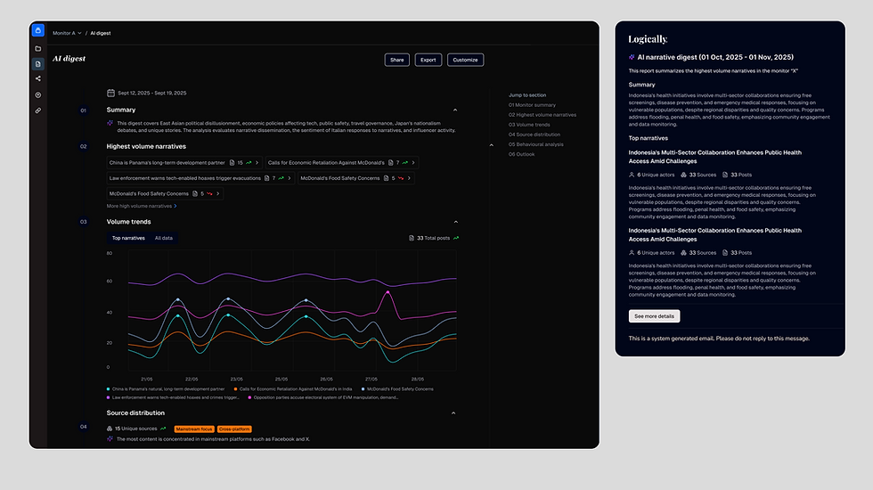
AI Digest. From three days of manual reporting to an automated intelligence brief
Learnings and outcomes
Key learnings
-
Clustering conflates opposing viewpoints. Pro- and anti-vaccine content grouped by semantic similarity hides the distinction that matters most — one of the hardest unsolved problems in narrative intelligence.
-
Design the AI outputs, not just the interface around them. The enrichment testing sessions produced the most actionable feedback of the entire project — the content mattered more than the interface.
-
Narratives were static, and that shaped everything. The system generated narratives at a point in time with no way to reflect changes. The tension between snapshot and stream drove the evolution across all three versions.
-
Naming and framing shape what analysts trust. "Narrative" vs "cluster," "coordination" vs "CIB" — language choices had real consequences for how analysts interpreted the system.
Outcomes
-
Clicks on individual narratives and narrative-specific feedback increased by 40% compared to the three months before the change. Analysts consistently reported that narrative relevance improved — what previously took several clicks to navigate between views now took one.
-
Service desk tickets decreased by 20% compared to the previous quarter, and analysts no longer needed dedicated documentation walkthroughs to understand how narratives worked.
-
The AI Digest received positive feedback, though logins slightly decreased — analysts were getting enough from the email. We addressed this by sending only a snippet, pulling them back into the platform for the full picture.
-
Users also asked for custom narratives specific to their mission — a clear signal for the product roadmap.